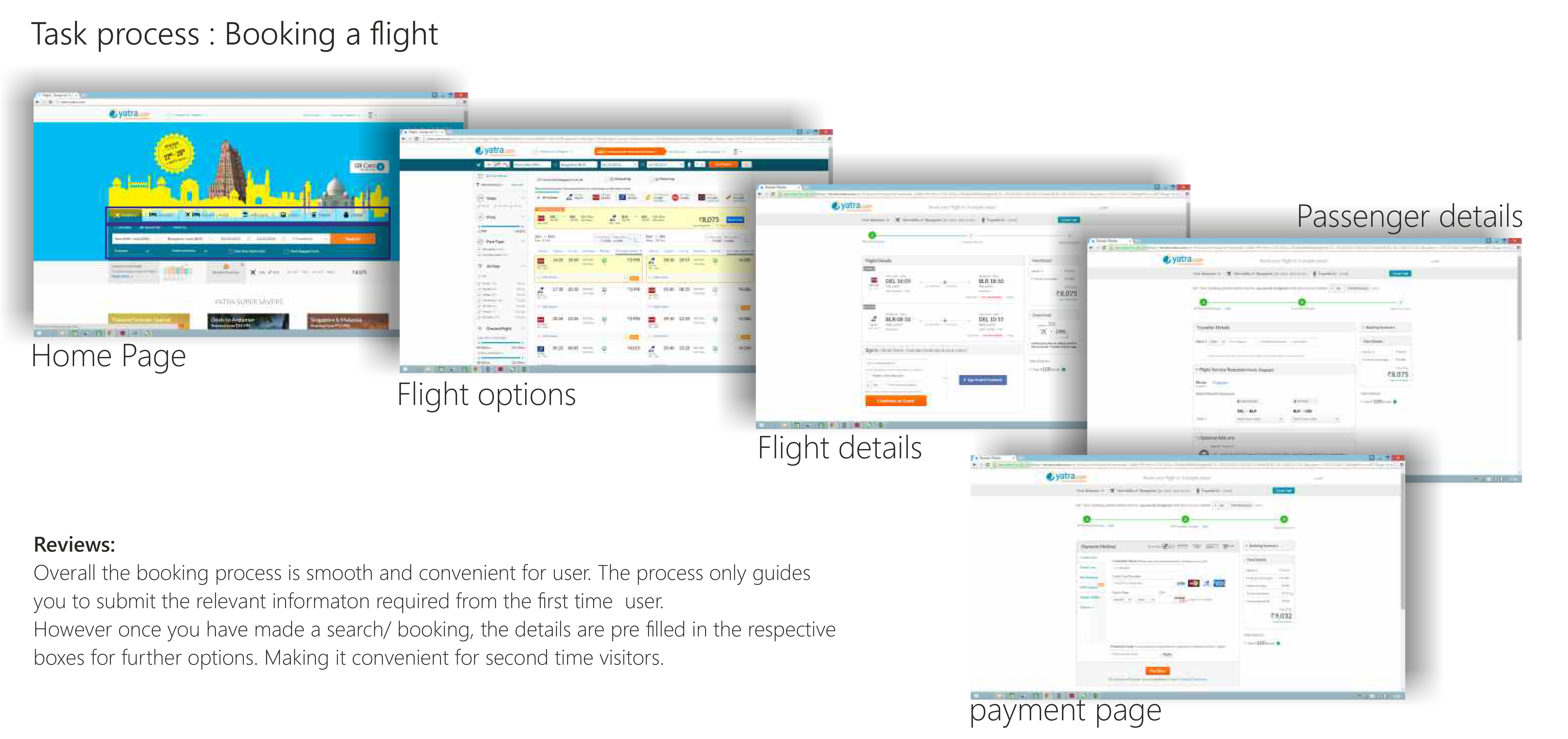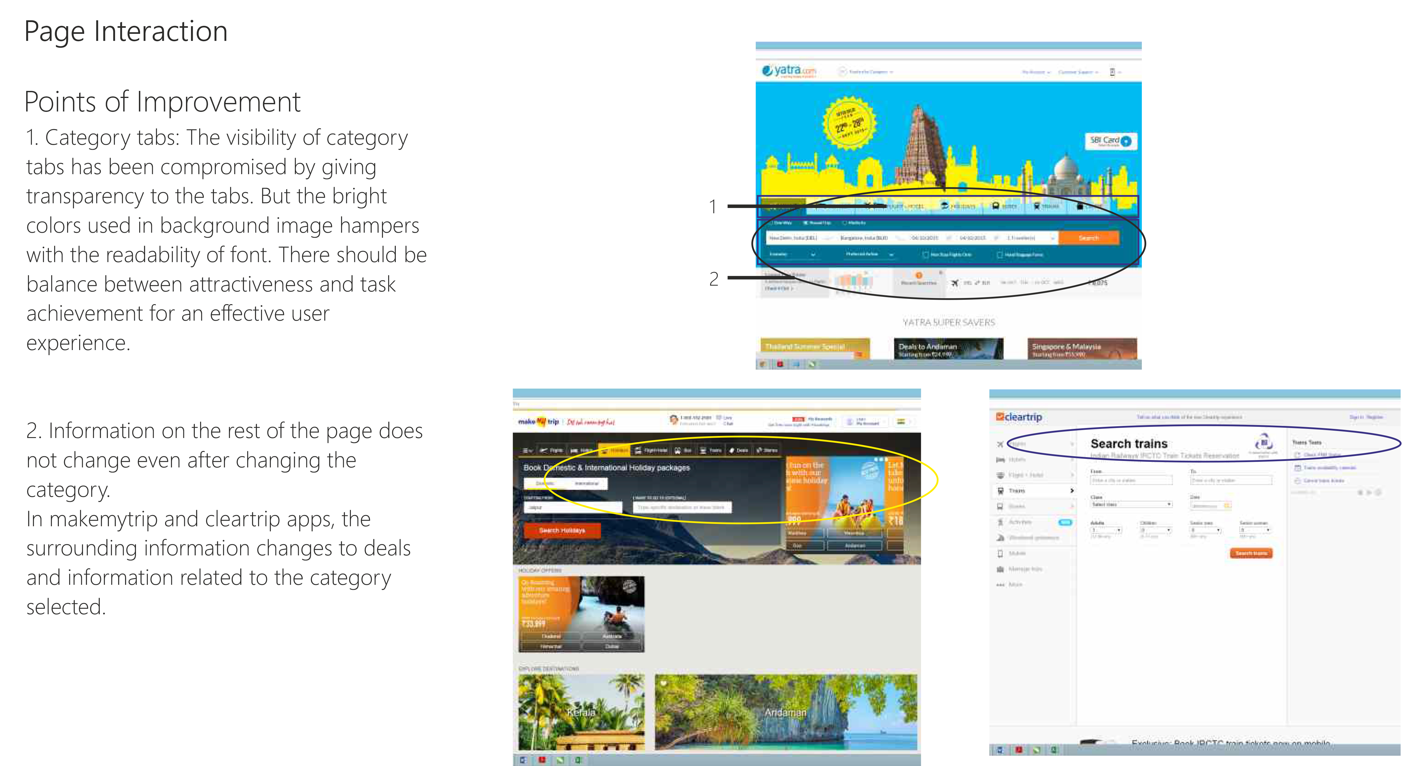
MyBupa App
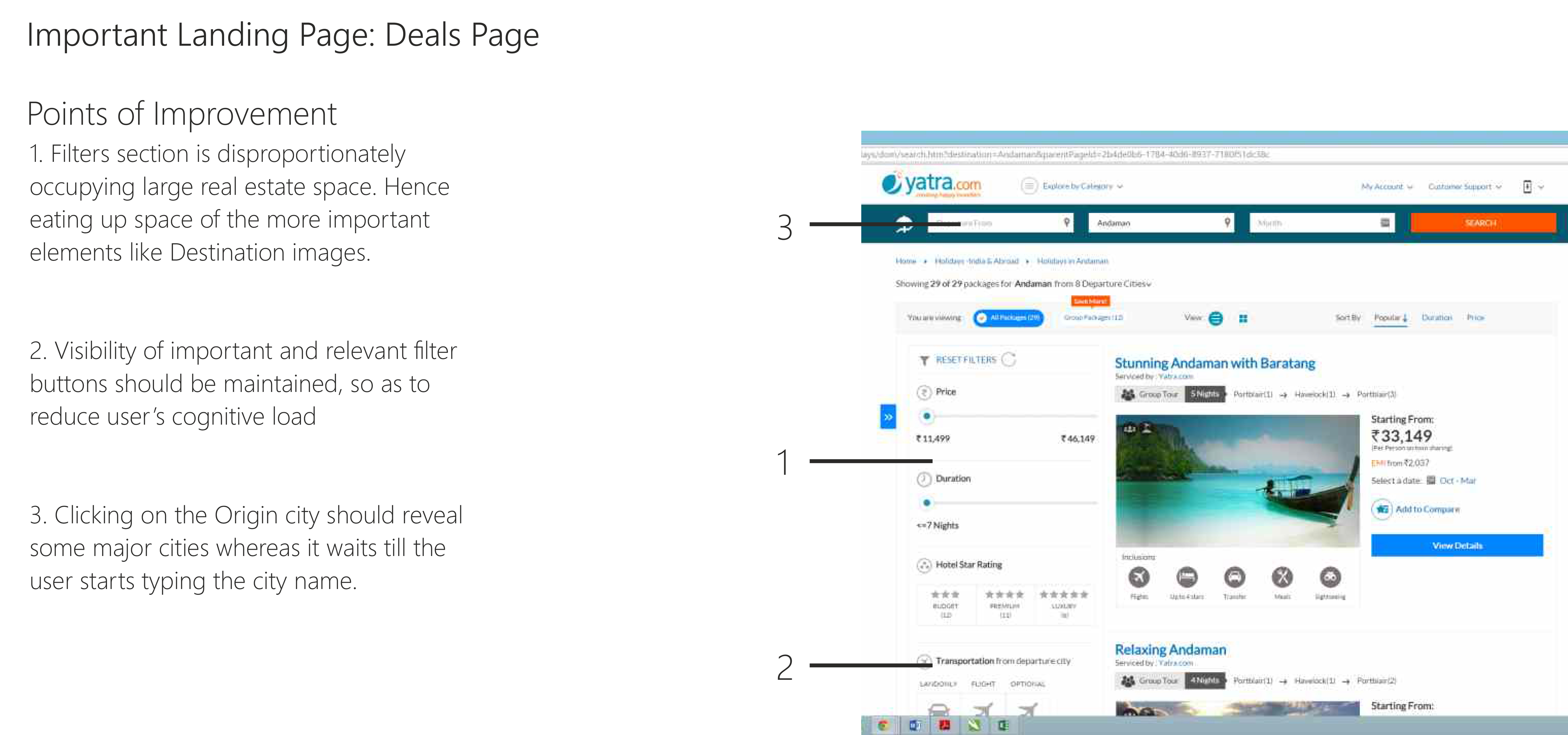
IA and Navigation redesign
Project overview
The goal of the project is to develop an intentional, scalable system to improve wayfinding across our core HI digital experiences for current and future propositions.
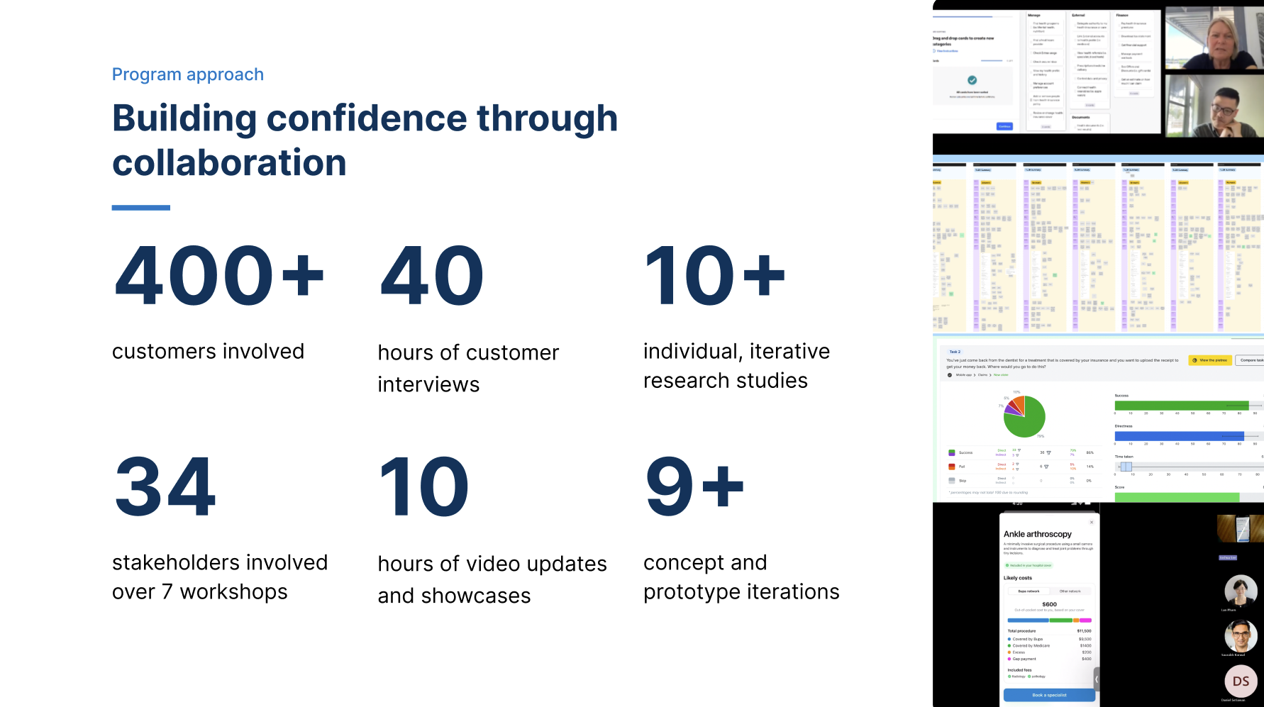
I had the privilege of collaborating with a Principal Researcher and a Content Designer to spearhead this transformative project.
Our initiative began with a comprehensive engagement strategy, where we proactively connected with key stakeholders to meticulously gather data on user behaviours, use cases, and navigation paths. This foundational research was pivotal in identifying critical customer tasks and scenarios, ensuring our solutions were deeply rooted in user needs and preferences.
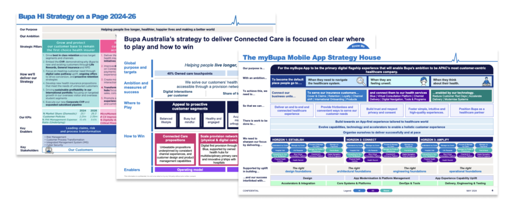
Additionally, we strategically aligned our efforts with existing and upcoming programs of work and initiatives within the organisation. This alignment not only facilitated synergy across projects but also ensured that our solutions seamlessly integrated into broader organisational objectives, maximising impact and sustainability.
My role:
Throughout this collaborative effort, I played a key role in synthesising research findings, facilitating productive discussions, and translating insights into actionable strategies
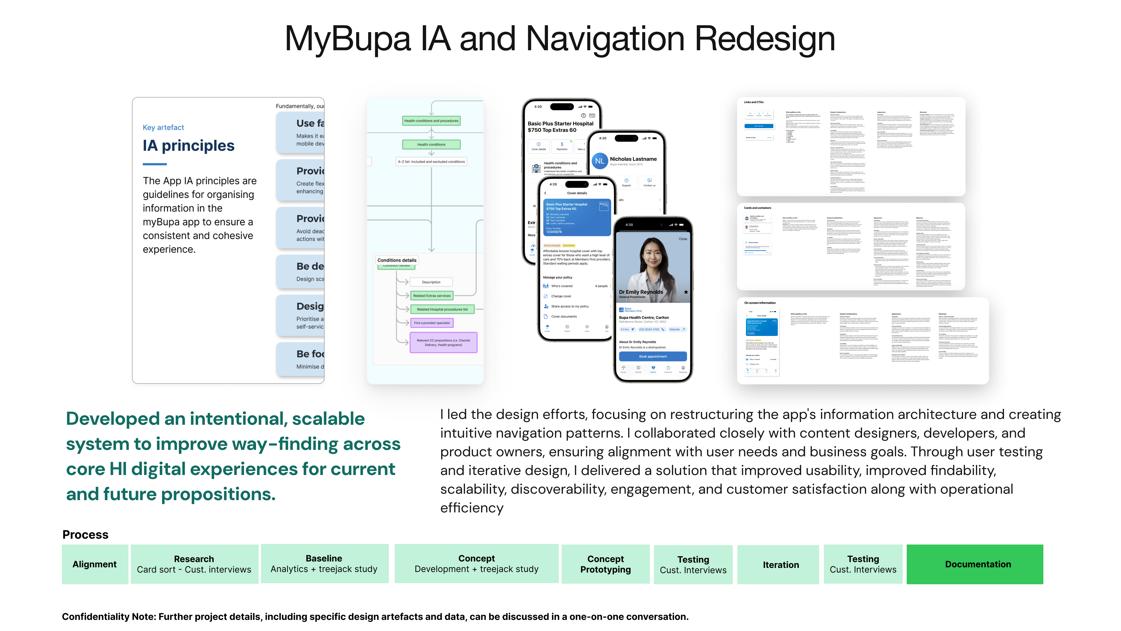
Lastly, I translated the findings into meaningful and logical customer centric Information Architecture, a relationship map and a sitemap. I am currently in the process of creating wireframes and clickable prototypes to test with customers and stakeholders.
Program Focus
Develop an intentional, scalable system to improve wayfinding across core HI digital experiences for current and future propositions.
Problem space
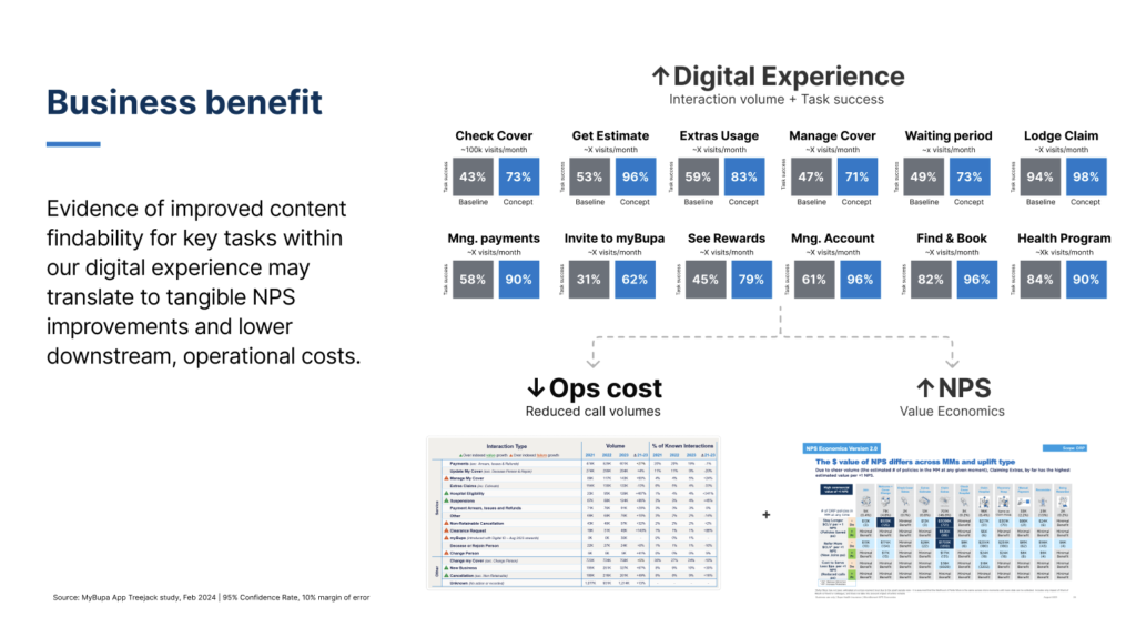
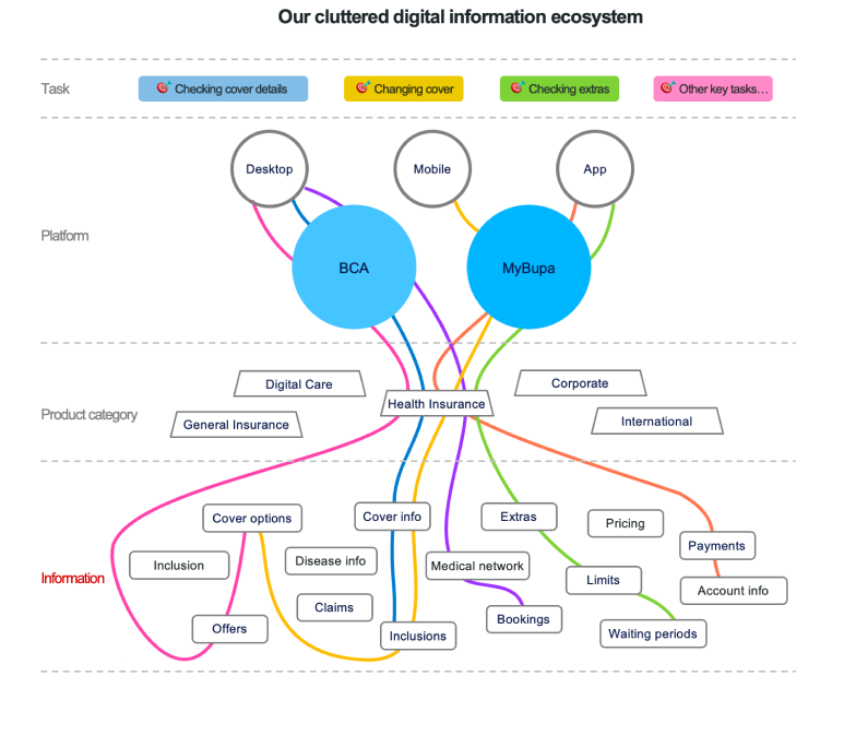
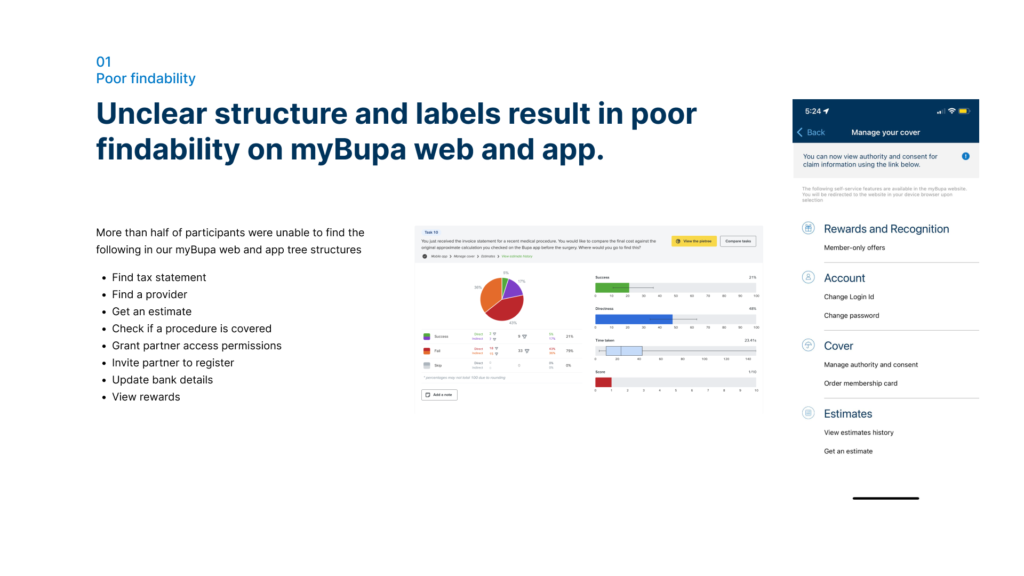
Poor findability – Unclear structure and labelling have led to serious usability issues, including task failure and cognitive load. For example, 79% of participants in a recent study couldn’t find where to ‘get an estimate’ in the myBupa app.
Inconsistent experience – Our digital content ecosystem has grown without intervention from guiding principles and schemes, leading to inconsistent navigation and disconnected journeys across our channels.
Scalability challenges – Cluttered navigation menus have made it difficult to surface new propositions, like Connected Care and Life Rewards. And it’s only getting worse
Operational inefficiency – Without a defined process and engagement model, IA decision-making is slow and uncertain
Key milestones and activities
We followed a meticulous and customer centric approach to effectively tackle the challenges and constraints faced by this project
01 Alignment
Kick Off
“>Align on project goals, gather current and future user tasks for myBupa
02 Research
Baseline and analytics review
Understand key navigation pain points eg. 79% of participants in a recent study couldn’t find where to ‘get an estimate’ in the myBupa app.
03 Research
Preliminary modelling
Preliminary modelling to identify key objects, actions, and taxonomies.
04 Research
Card sort learnings
Explore how users categorise current and future myBupa functionality and mental models
05 Concepts
IA and Navigation concepts
“>Ideate on potential concepts
06 Concepts
Testing and Iterations
Test with users and stakeholders to ensure seamless findability and scalability
07 Execution
Governance model
Define operational model for IA best practices and change process and management
08 Next horizons
Repeatable process
Define a tested process that can be used for future IA and Nav projects
Kick-off
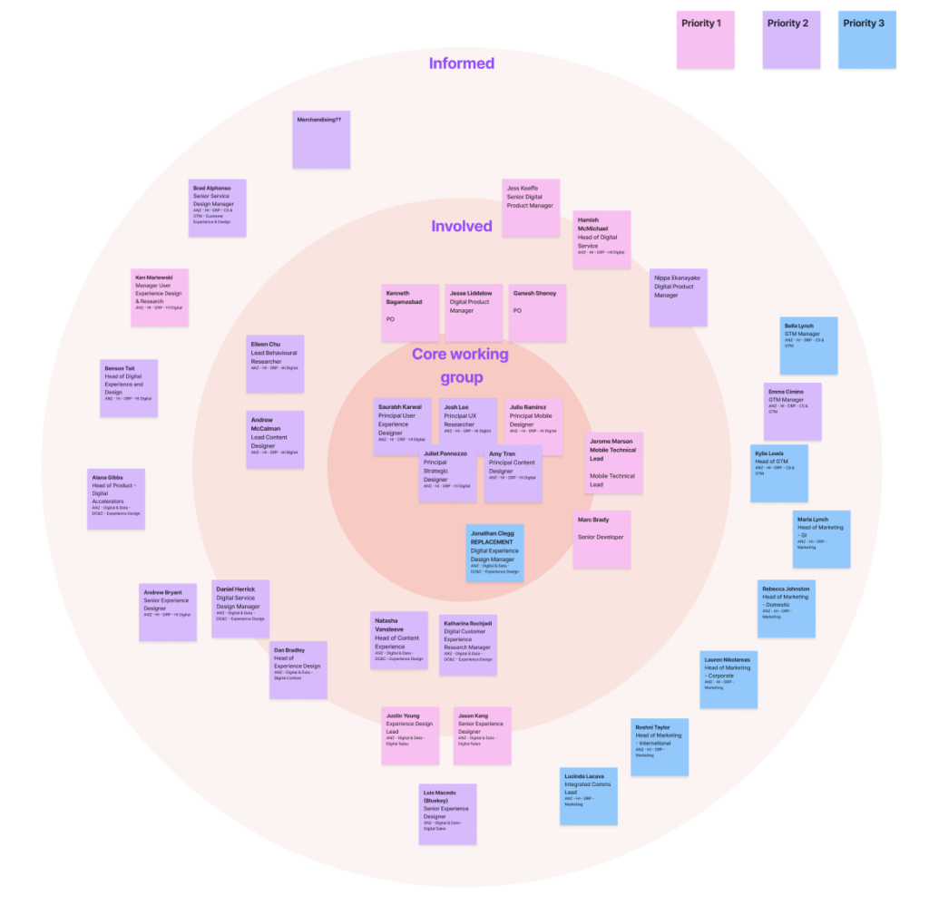
In this initial phase, we collaborated closely with stakeholders, including product managers, developers, and business analysts. Our focus was on understanding project goals, user needs, and business requirements. Key activities included:
- User Research: Conducted interviews and workshops to gather insights into current user behaviors and pain points.
- Task Analysis: Identified common tasks performed by myBupa users.
- Goal Alignment: Ensured everyone was on the same page regarding project objectives.
Additionally, we strategically aligned our efforts with existing and upcoming programs of work and initiatives within the organisation. This alignment not only facilitated synergy across projects but also ensured that our solutions seamlessly integrated into broader organisational objectives, maximising impact and sustainability.
My Role:
Throughout this collaborative effort, I played a key role in
- Mapping out all key stakeholders and initiating conversations,
- Synthesising research findings from various areas,
- Facilitating productive discussions,
- Translating insights into actionable strategies
- Defining achievable timelines
Baseline and analytics review
During this stage, we conducted comprehensive analyses to gain deep insights into current user behaviours, pain points, and navigation challenges within the existing app. This phase was instrumental in informing strategic decisions and laying the groundwork for an optimised user experience.
Key Activities:
Analytics Assessment:
- Data Collection: Gathered quantitative data from analytics platforms to understand user interactions, navigation paths, bounce rates, and other relevant metrics.
Qualitative Research:
- User Interviews: Conducted in-depth interviews with a representative sample of myBupa app users to gather qualitative insights into their experiences, pain points, and preferences.
- Usability Testing: Facilitated usability testing sessions to observe how users interacted with the current navigation structure and to identify usability issues.
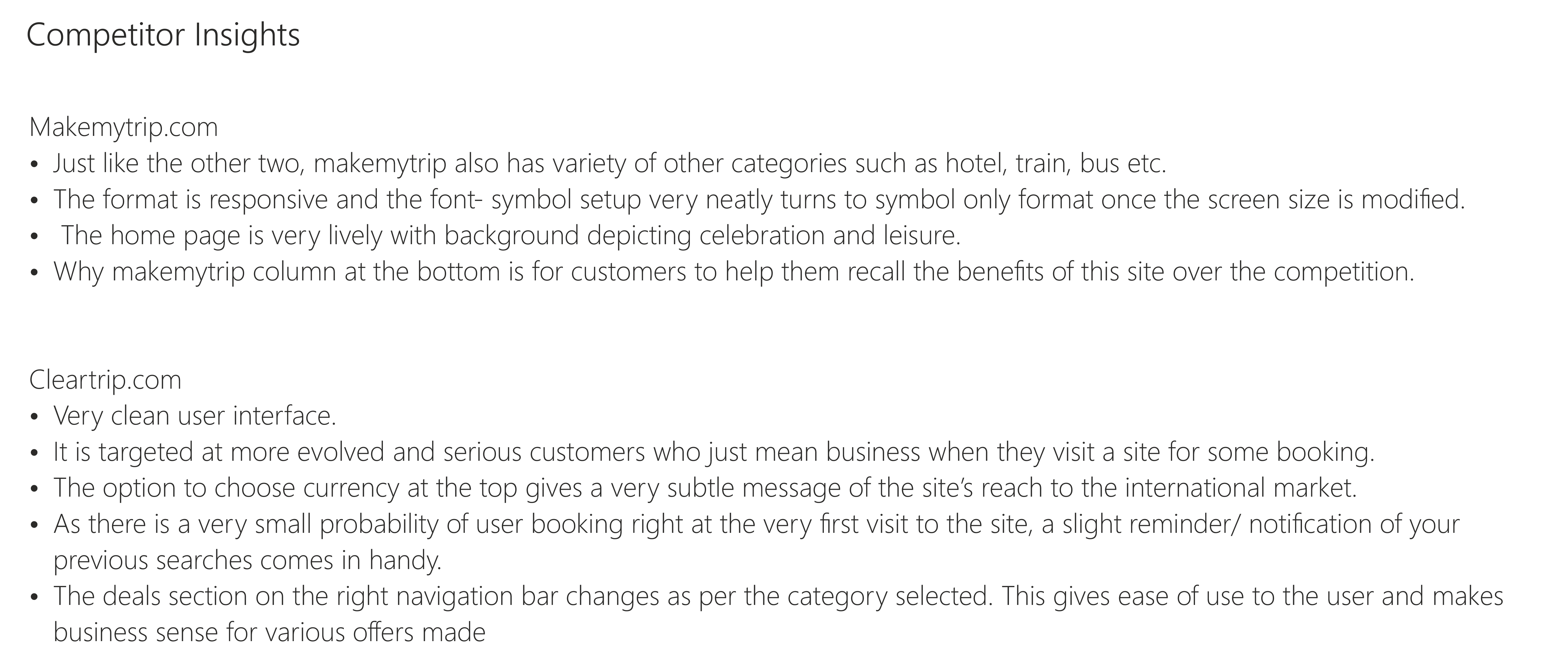
Competitive Analysis:
- Benchmarking: Analysed competitors’ apps and industry best practices to benchmark myBupa’s navigation and information architecture against leading standards.
- Feature Comparison: Evaluated feature sets, navigation patterns, and design approaches to identify opportunities for differentiation and improvement.
Data Synthesis and Insights Generation:
- Insights Compilation: Synthesised findings from quantitative analytics, qualitative research, and competitive analysis into actionable insights and recommendations.
- Identified Pain Points: Documented specific pain points and usability issues identified by users, prioritising them based on severity and impact on user experience.
My Role:
My key role was to guide the research activities in this stage to enable the Principal researcher plan and implement their activities efficiently and gather usable insights from Customers, Business, Tech teams and market. I also enabled highlighting and refining the insights relevant to the IA and Navigation of myBupa app.
Use Cases
Analytics review
Preliminary modelling
This phase was crucial in organising information in a way that aligns with user mental models, facilitates intuitive navigation, and enhances overall usability within the myBupa app.
Key Activities:
Object Oriented UX Principles:
- Identifying Objects: Defined core objects within the myBupa app, such as user profiles, health records, insurance plans, and appointment scheduling.
- Understanding Relationships: Analysed relationships between objects to determine how they interact and support user tasks and workflows.
Content Audit and Inventory:
- Content Assessment: Conducted a thorough audit of existing content within the app, identifying redundancies, outdated information, and gaps.
- Content Inventory: Created a comprehensive inventory of all content elements, categorising them based on relevance, importance, and user priority.
Hierarchical Tree Structure Design:
- Information Hierarchy: Developed a hierarchical structure for organising content and features within the myBupa app, ensuring that key information is easily accessible and prioritised.
- Navigation Flow: Designed intuitive navigation flows that guide users logically through the app, supporting seamless transitions between related content areas..
My Role:
The Preliminary Modelling stage laid a solid foundation for the myBupa Information Architecture and Navigation Redesign project by:
- Clear Content Structure: Assisted in defining a clear and organised structure for app content based on Object Oriented UX principles, enhancing usability and user engagement.
- Improved Information Access: Established a logical information hierarchy and navigation flow, making it easier for users to find and interact with relevant information and features.
- Prototype Validation: Validated early design concepts through iterative prototyping and user testing, refining the IA design based on user feedback and usability insights.
By focusing on structured content modelling and user-centric design principles, this stage set the stage for developing a more intuitive and user-friendly information architecture within the myBupa app. It aimed to enhance overall user experience by optimising content organisation, navigation paths, and task completion efficiency.
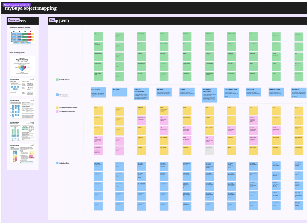
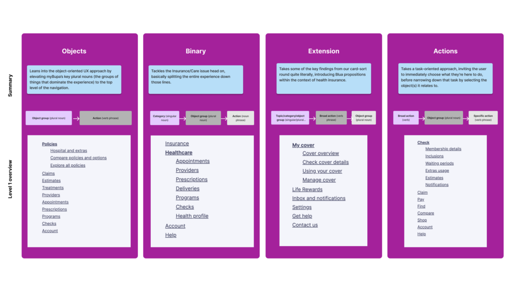
Content modelling
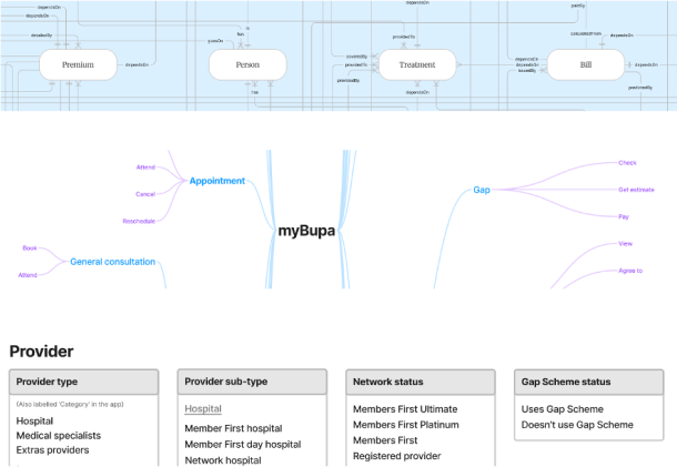
Object and relationship mapping: OOUX
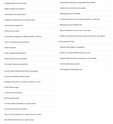
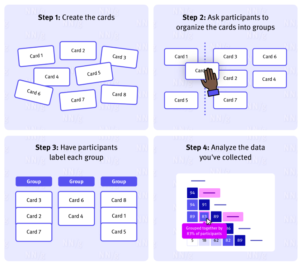
Card sort - uncovering user mental models for better Information Architecture
In a card sort study, participants place individually labeled cards into groups that make the most sense to them.
This informs ideas into how we might structure information in our digital experience to make it easy for others to find.
In our customer interviews we…
- Explored their experiences navigating the health system
- Their perception and use of PHI and digital experiences
- Conducted a card sort activity asking users to naturally group the tasks curated from stakeholders inputs.
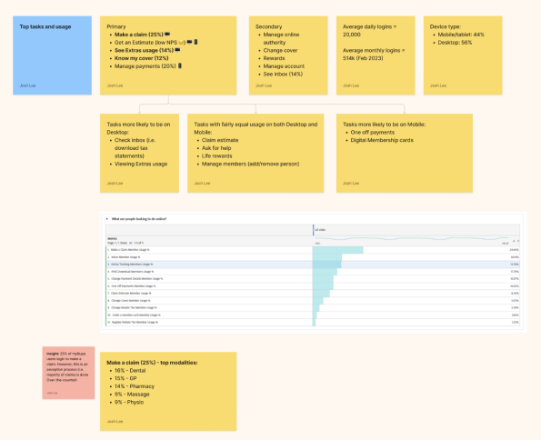
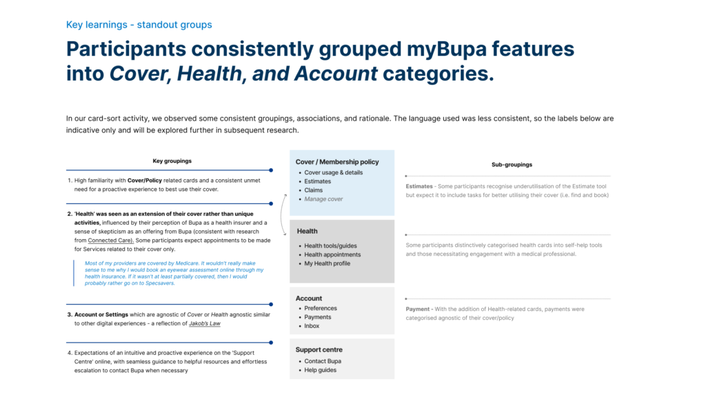
Sample insights
Initial tree structures
Evaluating early concepts of different menu labels and categories for findability.
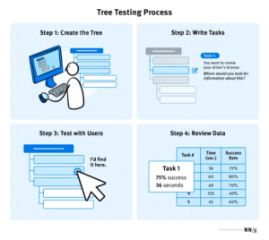
Tree testing allowed us to test our site structure, categorisation and labels before we designed a user interface. It evaluates a hierarchical category structure, or tree, by having users find the location/path in the tree where specific tasks can be completed.
For each task, we looked to understand:
Task success
Time taken
First click
Path taken
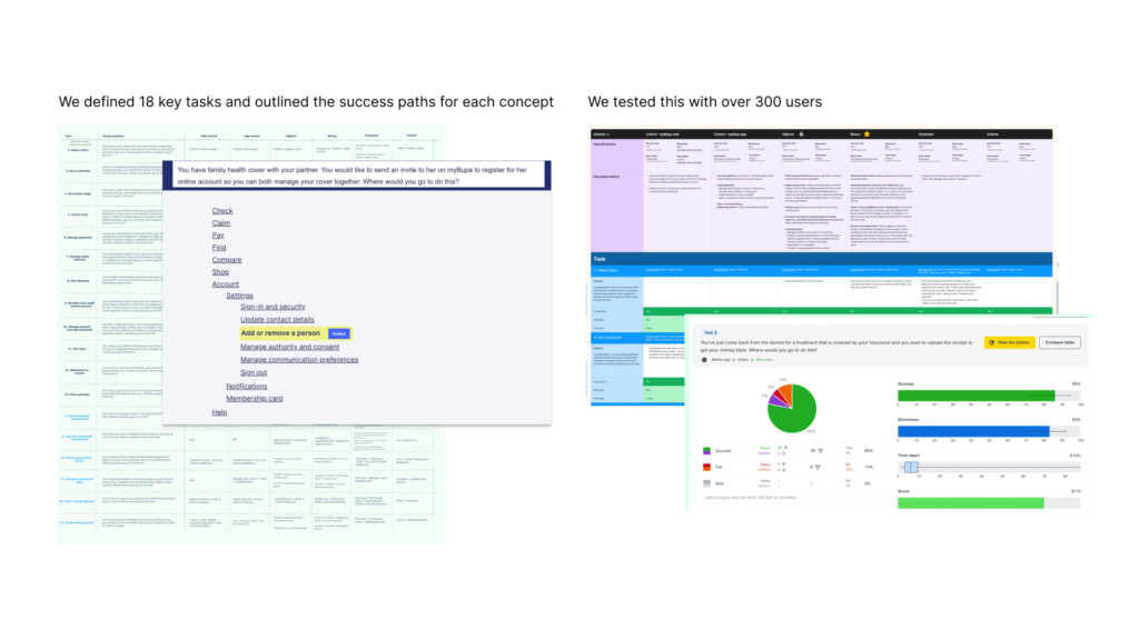
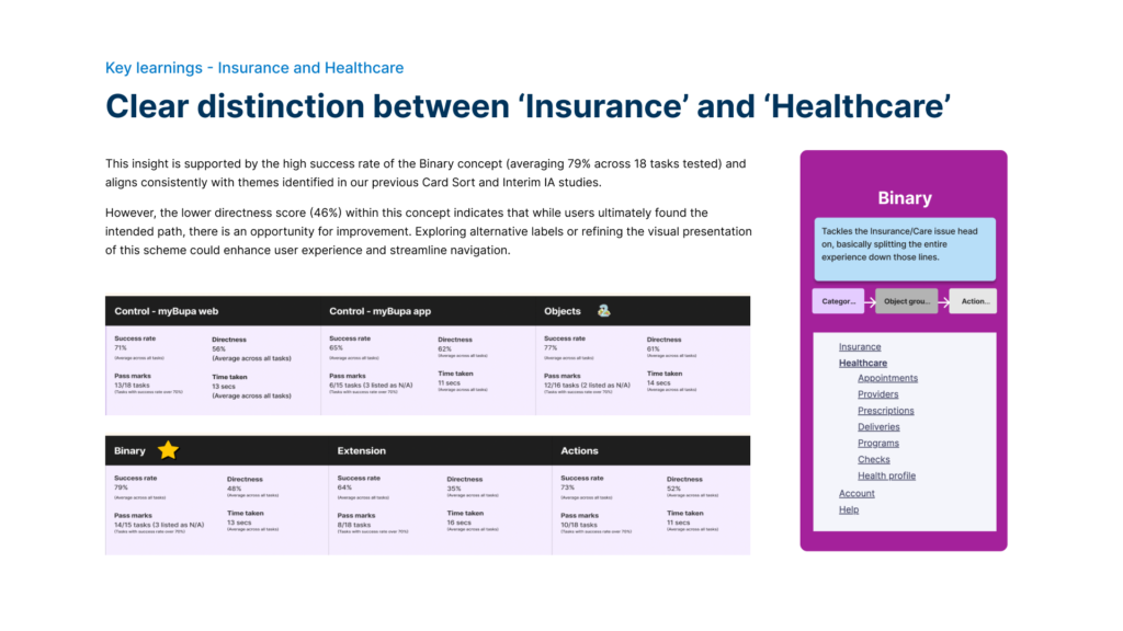
Sample insights
IA and Navigation Design
This phase was pivotal in transforming insights from research into actionable design solutions aimed at improving user experience and operational efficiency within the app. This stage focused on conceptualising and visualising new IA structures and navigation flows that address identified pain points and align with user needs and expectations.
Key Activities:
Conceptual IA Design:
- Synthesising Insights: Integrated findings from baseline reviews, analytics, and user research to inform the design of a new IA framework.
- Iterative Refinement: Developed multiple IA concepts and navigation models, refining them through collaborative workshops and stakeholder feedback sessions.
Navigation Structure Development:
- Information Architecture Mapping: Defined clear hierarchies and taxonomies for organising app content, ensuring logical groupings and easy navigation paths.
- Navigation Patterns: Established intuitive navigation patterns, such as breadcrumb trails, mega menus, or sidebar navigation, to facilitate seamless user interactions.
Wireframing and Prototyping:
- Visualising Concepts: Created detailed wireframes and interactive prototypes to visualise IA concepts and navigation flows.
- User Testing: Conducted usability testing sessions with representative users to gather feedback on navigation clarity, findability of content, and overall user satisfaction.
Accessibility and Scalability Considerations:
- Scalable Design: Designed IA structures that can accommodate future growth and new features, ensuring scalability and adaptability over time.
- Accessibility Compliance: Ensured that navigation designs meet accessibility standards, making the app usable for all users, including those with disabilities.
Stakeholder Alignment and Iterations:
- Collaborative Workshops: Engaged stakeholders, including UX/UI designers, product managers, and developers, in collaborative workshops to refine IA designs and ensure alignment with project goals.
- Iterative Refinement: Iteratively refined IA and navigation designs based on stakeholder feedback and usability testing insights, aiming for continuous improvement and optimisation.
My Role:
I contributed to the design phase of the project by producing several key outcomes:
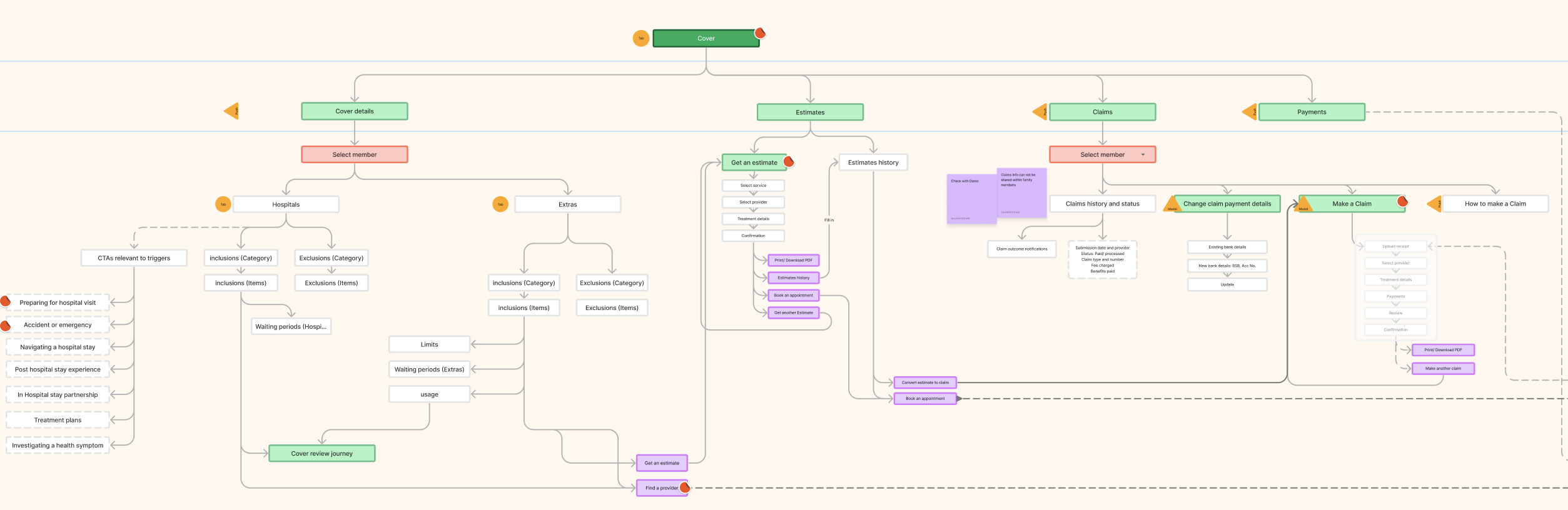
- Information sitemap: I created a visual representation of the organisation of the App’s content. The aim is to understand high level grouping, structure and hierarchy of our digital experience
- Interaction map: To understand navigation and interaction paths customers may take within our digital experience.
- Navigation schemes: Including labels, patterns and page types. To enable consistency within our digital experience as we add new propositions. Also to improve velocity and reduce effort to create new experiences.
- Benefit model: To inform business case and impact measurement.
Key outcomes:
- Enhanced User Experience: Developed intuitive navigation structures that improve user journey efficiency and task completion rates.
- Improved Findability: Optimized IA design to make critical information and features more discoverable, reducing user frustration and enhancing satisfaction.
- Alignment with User Needs: Ensured that IA decisions were driven by user insights and aligned with user mental models and expectations.
- Future-Proof Design: Established a scalable IA framework capable of accommodating future app enhancements and updates, minimising disruption and maintaining consistency.
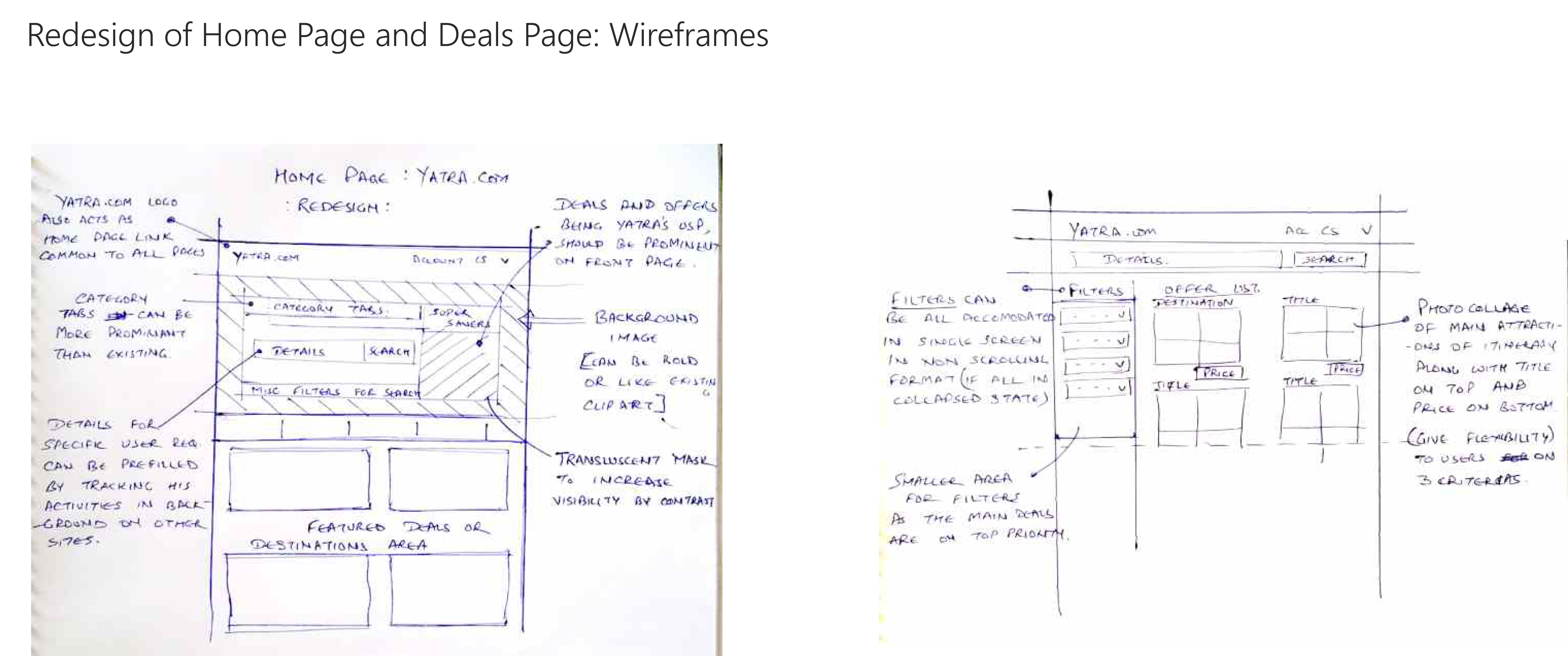
Sample artefacts
Interaction map
Low Fidelity wireframes and prototype
High fidelity prototype
Testing and iterations
To ensure the IA and navigation redesign was user-friendly and effective, we conducted multiple testing phases followed by iterative improvements.
1. Usability Testing
- Moderated & Unmoderated Testing: We ran both moderated and unmoderated tests with diverse user groups. These sessions provided key insights into user behaviour, helping us identify pain points and improve navigation flow.
2. Key Metrics
- Task Success & Time on Task: We tracked how easily users could complete tasks and how long it took, aiming to streamline navigation and improve efficiency.
- Click Path Analysis: This helped us optimise user journeys by removing unnecessary steps.
3. A/B Testing
A/B tests compared different versions of the navigation structure, ensuring the most effective design was selected.
4. Accessibility Testing
The redesign was thoroughly tested for accessibility, meeting WCAG 2.1 AA standards, with screen reader and keyboard navigation assessments.
5. Iterative Design
Based on test results, we refined labels, hierarchy, and flow in several rounds of design iterations, ensuring continuous improvement.
Future Governance Model: Sustaining Excellence in IA Practices
In future endeavors, establishing a robust Governance Model for Information Architecture (IA) will be paramount to maintaining consistency, quality, and effectiveness across digital platforms. This model will focus on defining clear roles and responsibilities, ensuring that teams are equipped to manage, update, and scale IA solutions effectively. Emphasis will be placed on developing comprehensive documentation outlining IA principles, guidelines, and best practices. Regular audits and reviews will be conducted to assess performance and alignment with evolving user needs and industry standards. Training programs and knowledge-sharing initiatives will foster a culture of continuous learning and expertise development, ensuring that IA excellence remains a cornerstone of our digital strategy.
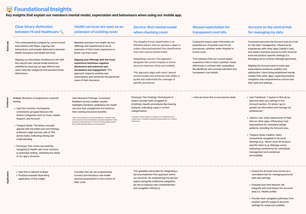
IA and Navigation principles
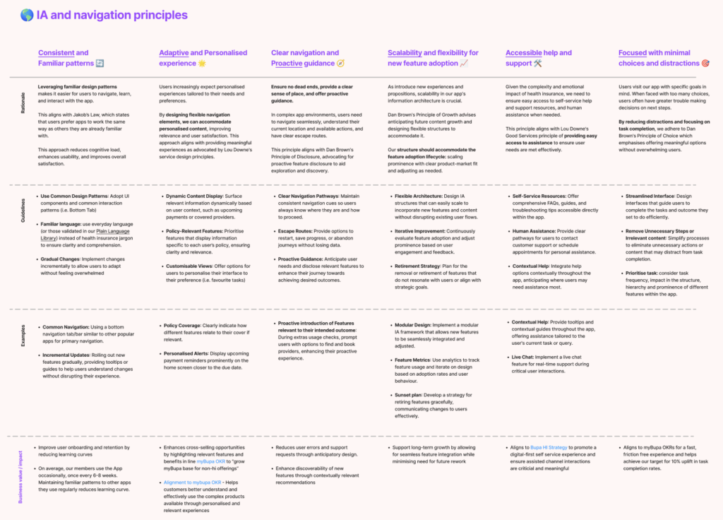
Foundational insights for future IA projects
Repeatable Process for IA Projects
Understand current state and systems
Baseline and understand current reality, capability and dependencies.
- Kick off and alignment
- Stakeholder map
- Content audit
- Navigation baseline (findability)
- Analytics review
- Current state IA map
Explore customer mental models
Understand how customers intuitively think, group and find different content
- Card sort
- Customer interviews
- IA concept schemes
IA concepts and navigation patterns
Develop IA concepts and navigation patterns through iterative evidence-based learnings
- IA concepts and schemes
- Customer Treejack testing
- IA structure (tree, sitemap)
- Navigation patterns & page types
- Prototypes
- Customer testing
Recommendation and governance
Documentation, artefacts, benefit modelling and process to manage immediate & future change
- IA artefacts (Sitemap, navigation patterns)
- Benefit modelling
- Roadmap and implementation planning
- Change management
- Governance process, roles and responsibilities
Achievements and impacts
Success Metrics: